
The Aesthetics of Dune
I’ll be honest — sometimes I pick a topic to write on because it’s close to the top of the stack — and being able to put a thumbnail on the article that contrasts with recent ones is also a big help. I’m seeing a lot of pale, muted colors or intense blues, so I’m feeling something orange. I have to rush out the door in a bit to teach, so you’ll have to forgive me for going with what’s current and convenient, rather than what’s capital-I Important.
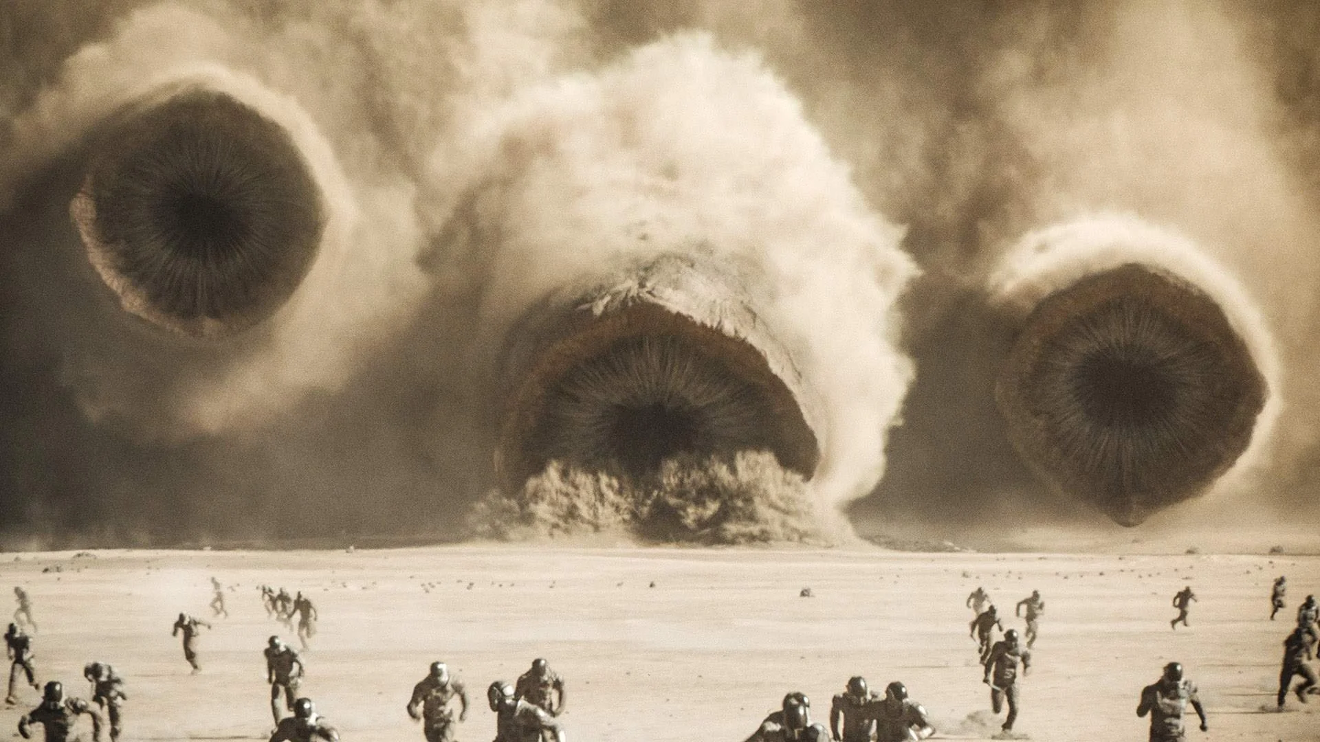
Quite the visual. I couldn’t help but think about Sean T. Collins’s writing on the “Monumental Horror Image”, though it takes a bit of thinking to realize that Dune has elements of horror in it. Of course, it isn’t quite apt: the sandworm is always in motion, its monumentality coming from its vast scale.
Yesterday, Edgar and I went with a friend to see Dune: Part 2. Generally speaking, I like Frank Herbert, but I happen to think that Villeneuve improved on the source material somewhat — Herbert, like many genre writers in the 1960s, had a tendency towards maximalism and this tended to fuzz his meaning somewhat when read by modern readers. It seems to me that Villeneuve stripped away a lot of noise from the signal and made it clearer that this is a story, generally, without heroes (one might argue that Chani, the character played by Zendaya, is the “hero” of this movie, being the viewpoint character toward the end and its moral center throughout.)
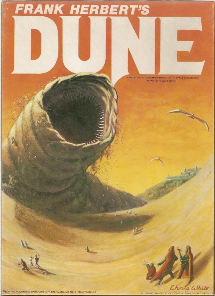
What I wish to talk about, though, are the aesthetics in play: many people discuss how visually striking the movie is, and I certainly agree, but it’s imagery that I’ve seen before. My response isn’t shock and surprise at the image, mine is shock and surprise that they actually managed to borrow, stylistically, from the original art, and from 3rd-quarter twentieth century science fiction art in general. Consider the cover of the first edition, at right.
Fully open, the mouths of the iconic sandworm are identical, though there are elements in the Villeneuve film that show a slightly greater attention paid to making them appear to be flesh-and-blood creatures (the slight prominences around the mouth in a diamond pattern, without being quite radially symmetrical, a slight nod to the original John Schoenherr artwork, which first appeared alongside the earliest publications of Frank Herbert’s novel in Analog magazine in 1965, which depicted the creature with the later-ubiquitous three-part mouth that has appeared in other adaptation of the books in other media, seen below:
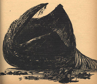
This same set of images have been reproduced elsewhere. Almost all, ultimately, have been descended from Schroenherr’s original sketch, with some rare, sharp divergence. Notably, in the aborted Dune film planned by Alejandro Jodorowsky, which featured designs produced by H.R. Geiger, which — ultimately — look more like Geiger’s other work than anything produced by anyone else.
Honestly, I’m surprised that telling H.R. Giger to “make a big worm” didn’t result in something more phallic.
That movie, of course, was more like a fever dream than anything else. Imagine, if you will, a film of the same scale as the Villeneuve adaptation produced in the mid-1970s. It would have featured Salvador Dali (who demanded $100k an hour for his time and was ultimately invited to leave not for reasons of cost but because of his Francoist sentiments) as the Emperor, Orson Welles as the Baron Harkonnen, and Mick Jagger as Feyd-Rautha. The special effects department was headed up by Dan O’Bannon (and it was this film, if I’m not mistaken that started the relationship between him and Geiger that would ultimately birth Alien later that same decade). There was talk of the soundtrack having been done by Stockhausen and Magma, though Pink Floyd was eventually tapped to do the work of putting it all together. Art direction was split between Geiger and Moebius. Frankly, the whole project was an incoherent fever dream, like so many of the artistic megaprojects of the 1970s.
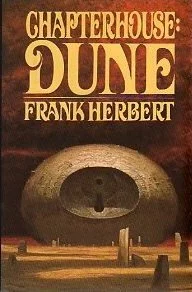
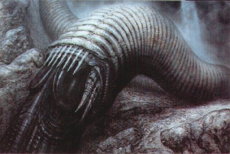
Another nod to the source material comes from the design of the machinery in use. In the 122 years that we’ve depicted space travel in film, we’ve had the chance to build up quite the vocabulary of design: there’s the classic rocket and flying saucer popular up through the 1960s, the hybrid design found in Star Trek and the more airplane-influenced designs of Star Wars. However, Dune has a particular approach. Consider the image at right, the cover of one of the latter Frank Herbert novels, unique in its color (more bronze, brass, or khaki than the silvery colors of his contemporaries) and its geometry (one could imagine this item, recast in white neoprene and black plastic, being a handheld device sold in a modern electronics shop). This is a sharp departure from the standard science-fictional aesthetics of the time, feeling more like an ancestor to what I’ve called Jobsian Minimalism in the past, but featuring a more Baroque appearance, harsher and cast in shadow.
Compare this same image to the Guild Highliner depicted in the movie. Its geometry and the texture of the object call to mind the same vocabulary of images depicted in the Herbert-Schoenherr complex that defined the original books.

I haven’t the access I need to prove this point, but consider that the composition of the book covers also influenced how the new films were shot: there’s a tendency towards low-angle images of monumental constructions, and a certain intentional flatness to the image, almost as if the frames of the film are the book covers come to life.
This is maintained in the film: we are being shown a universe that works on the monumental scale, and wants to heighten its human-scale protagonists to the same degree. This is also baked into the characters. The film is new enough that I’m reluctant to spoil it, but I can read this as being a question material to the film, something that it considers and insists upon grappling with.

You can almost understand the cartoonish villainy of the Harkonen when you see the world that they come from. They literally live beneath a black sun.
However, it’s more than just the titanic worms and hovering spaceships that form the central aesthetic of Dune — you also need to look at the environs, especially given how important the influence of ecosystem on psychology is to the original text. One of the boldest choices in the film was in the depiction of the Harkonen homeworld, Giedi Prime. The sequences were filmed using a modified IMAX camera, changed so that it recorded in infrared. The way that the images look on the screen are, as a result, subtly wrong in a way that bobs just below the threshold of conscious awareness.
This is a film that plays games with uncanniness. It takes familiar tropes and moves and places them into a context where they hit in a completely different way. The technical processes are skillfully done, producing a totalizing experience that brings to mind Mad Max: Fury Road in that it creates a kind of all-consuming image. However, I want to hammer home on the uncanny aspect a bit more.
Consider the real threat from the first movie, which sets up the crime uncovered in the second: the involvement of the emperor in the destruction of the Atreides. This was not simply something that the Harkonen were given permission to do, it was something that they were given assistance in doing. That assistance comes in the form of the Sardaukar:

They look like astronauts with swords and knives, and even in the atmosphere of a planet they sometimes move as if under lunar gravity. Equipped with some kind of anti-gravity device they can descend from the great height like a spider dangling from a length of thread.
This is not something found in the book, but I think this is the real aesthetic innovation of the films: the mashup of something that we’re all familiar with (who hasn’t seen images of an astronaut growing up?), with something decidedly unfamiliar (moving as if under the influence of other physical laws) and the threat of violence. They are transformed from Imperial Stormtroopers into something more like surreal bogeymen, something that you could imagine yourself conceiving of while in the throes of a violent fever.
This, to me, is probably the best example of aesthetic innovation in these films: they gave tribute to materials from the past, but the filmmakers also pushed the bounds of what can be done with the art form. That, more than anything else, made it worth watching.
※
If you enjoyed reading this, consider following our writing staff on Bluesky, where you can find Cameron and Edgar. Just in case you didn’t know, we also have a Facebook fan page, which you can follow if you’d like regular updates and a bookshop where you can buy the books we review and reference (while supporting both us and a coalition of local bookshops all over the United States.) We are also restarting our Tumblr, which you can follow here.